

I stood in the center of my guest bedroom at 7:45 PM, a cold beer in one hand and a crusty paint roller in the other, feeling like I had been gaslit by a gallon of Sherwin-Williams. Twelve hours earlier, under the crisp morning sun, this room was the perfect shade of ‘Coastal Breezeway’—a sophisticated, airy blue that felt like a vacation. But as the shadows lengthened and I flipped on the bedside lamps, the walls didn’t look blue anymore. They looked like a bruised plum. I had spent two days on my hands and knees for what now looked like a 1990s teenage girl’s sanctuary. It was a classic metamerism trap, a frustrating phenomenon where colors shift their personality depending on the light source. If you are currently staring at your own walls wondering where you went wrong, take a deep breath. You are not losing your mind, and you are definitely not alone.
Why Your Paint Plays Mind Games at Night
Today, we are going to solve the mystery of the ‘Periwinkle Pivot’ once and for all. I am going to walk you through why that perfect blue turns violet, how to diagnose the red undertones hiding in your swatches, and what you can do to reclaim your original vision without necessarily starting from scratch. I once made the rookie mistake of choosing a paint color based solely on a tiny 2-inch paper swatch while standing in the middle of a fluorescent-lit hardware store. I ignored how natural sunlight changes the way your paint looks throughout the day, and it cost me a weekend of labor and a lot of pride. By the time I finished, the room was three different colors between dawn and dusk. It is a common pitfall in local painting projects, but it is entirely avoidable if you know the physics at play.
Is it actually the paint or am I just crazy?
It is easy to assume the store mixed the wrong tint, but the science usually points elsewhere. According to the Illuminating Engineering Society (IES), the spectral power distribution of your light source—whether it is the warm orange of a setting sun or the yellowish glow of an incandescent bulb—completely dictates which color wavelengths are reflected back to your eyes. When the sun dips below the horizon, the cool blue light of midday disappears, leaving behind longer red wavelengths. If your blue paint has even a tiny drop of magenta or red in its base, those evening rays will amplify those pigments, turning your peaceful blue into a startling purple. [IMAGE_PLACEHOLDER] It is the same reason why your office walls look different depending on the bulb you choose. Understanding this shift is the first step in expert house painting advice for 2025 because modern LED lighting can be even more deceptive than old-school bulbs. To really master the art of house painting, you have to look at your walls when the sun is at its weakest, not its strongest. Have you ever finished a room only to find it looks like a completely different color four hours later? I’d love to hear about your most frustrating color-shifting mishaps in the comments.
Stop Relying on Tiny Paper Swatches
You cannot trust a one-inch square of paper to tell you the truth about a gallon of liquid pigment. The biggest mistake I ever made—the one that left me with that ‘bruised plum’ guest room—was trusting the store swatch. To truly color your world with expert house painting advice for 2025, you have to use the ‘Moveable Swatch’ method. Instead of painting directly on the wall, paint two coats on a large piece of foam core board. I once did this with a shade called ‘Industrial Zinc’ and moved it from the window to the darkest corner of my hallway. In the morning, it was gray; by dinner, it was lavender. By moving the board, I saw the shift coming before I ever opened the final can. This prevents the nightmare of having to remove dried paint drips or repainting an entire room because you didn’t see the undertone shift in time.
Swap Your Bulbs Before You Re-Prime the Room
Before you rush back to the store to demand a refund, look up at your ceiling. Most of us use ‘Soft White’ bulbs, which sit around 2700K on the Kelvin scale. These bulbs emit a heavy yellow-orange glow that acts like a warm filter over your walls. When that yellow light hits a blue wall, the primary colors mix in your brain to create—you guessed it—purple. I recently consulted on a local painting project where the homeowner was distraught over their ‘Navy’ kitchen turning ‘Eggplant.’ We didn’t touch the paint. We simply swapped their 2700K bulbs for 4000K ‘Cool White’ LEDs. The violet vanished instantly. 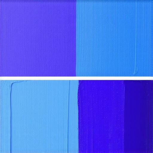 Understanding why your office walls look different depending on the bulb is often the cheapest fix in your DIY arsenal. Check your bulb packaging; if you want your blues to stay blue, aim for a higher Kelvin rating to mimic natural daylight.
Spot the Hidden Pigment in Your Blue Paint
If your paint still looks purple even under neutral light, the problem is in the base. Every blue has a ‘leaning’—it is either a green-blue or a red-blue. If you want to master the art of house painting, you need to learn to look for the ‘dirty’ undertones. Red-based blues will always gravitate toward purple in low light. When you are at the paint counter, ask the pro to show you the color formula. If you see ‘Y’ (yellow) or ‘G’ (green) in the tint, you are safe. If you see ‘R’ (red) or ‘M’ (magenta), that blue is a purple-traitor waiting to happen. To refresh your living space without these surprises, always compare your blue swatch against a piece of true-blue construction paper; the red undertones will leap out immediately.I stood in the center of my guest bedroom at 7:45 PM, a cold beer in one hand and a crusty paint roller in the other, feeling like I had been gaslit by a gallon of Sherwin-Williams. Twelve hours earlier, under the crisp morning sun, this room was the perfect shade of ‘Coastal Breezeway’—a sophisticated, airy blue that felt like a vacation. But as the shadows lengthened and I flipped on the bedside lamps, the walls didn’t look blue anymore. They looked like a bruised plum. I had spent two days on my hands and knees for what now looked like a 1990s teenage girl’s sanctuary. It was a classic metamerism trap, a frustrating phenomenon where colors shift their personality depending on the light source. If you are currently staring at your own walls wondering where you went wrong, take a deep breath. You are not losing your mind, and you are definitely not alone.
Why Your Paint Plays Mind Games at Night
Today, we are going to solve the mystery of the ‘Periwinkle Pivot’ once and for all. I am going to walk you through why that perfect blue turns violet, how to diagnose the red undertones hiding in your swatches, and what you can do to reclaim your original vision without necessarily starting from scratch. I once made the rookie mistake of choosing a paint color based solely on a tiny 2-inch paper swatch while standing in the middle of a fluorescent-lit hardware store. I ignored how natural sunlight changes the way your paint looks throughout the day, and it cost me a weekend of labor and a lot of pride. By the time I finished, the room was three different colors between dawn and dusk. It is a common pitfall in local painting projects, but it is entirely avoidable if you know the physics at play.
Is it actually the paint or am I just crazy?
It is easy to assume the store mixed the wrong tint, but the science usually points elsewhere. According to the Illuminating Engineering Society (IES), the spectral power distribution of your light source—whether it is the warm orange of a setting sun or the yellowish glow of an incandescent bulb—completely dictates which color wavelengths are reflected back to your eyes. When the sun dips below the horizon, the cool blue light of midday disappears, leaving behind longer red wavelengths. If your blue paint has even a tiny drop of magenta or red in its base, those evening rays will amplify those pigments, turning your peaceful blue into a startling purple. [IMAGE_PLACEHOLDER] It is the same reason why your office walls look different depending on the bulb you choose. Understanding this shift is the first step in expert house painting advice for 2025 because modern LED lighting can be even more deceptive than old-school bulbs. To really master the art of house painting, you have to look at your walls when the sun is at its weakest, not its strongest. Have you ever finished a room only to find it looks like a completely different color four hours later? I’d love to hear about your most frustrating color-shifting mishaps in the comments.
Stop Relying on Tiny Paper Swatches
You cannot trust a one-inch square of paper to tell you the truth about a gallon of liquid pigment. The biggest mistake I ever made—the one that left me with that ‘bruised plum’ guest room—was trusting the store swatch. To truly color your world with expert house painting advice for 2025, you have to use the ‘Moveable Swatch’ method. Instead of painting directly on the wall, paint two coats on a large piece of foam core board. I once did this with a shade called ‘Industrial Zinc’ and moved it from the window to the darkest corner of my hallway. In the morning, it was gray; by dinner, it was lavender. By moving the board, I saw the shift coming before I ever opened the final can. This prevents the nightmare of having to remove dried paint drips or repainting an entire room because you didn’t see the undertone shift in time.
Swap Your Bulbs Before You Re-Prime the Room
Before you rush back to the store to demand a refund, look up at your ceiling. Most of us use ‘Soft White’ bulbs, which sit around 2700K on the Kelvin scale. These bulbs emit a heavy yellow-orange glow that acts like a warm filter over your walls. When that yellow light hits a blue wall, the primary colors mix in your brain to create—you guessed it—purple. I recently consulted on a local painting project where the homeowner was distraught over their ‘Navy’ kitchen turning ‘Eggplant.’ We didn’t touch the paint. We simply swapped their 2700K bulbs for 4000K ‘Cool White’ LEDs. The violet vanished instantly. Understanding why your office walls look different depending on the bulb is often the cheapest fix in your DIY arsenal. Check your bulb packaging; if you want your blues to stay blue, aim for a higher Kelvin rating to mimic natural daylight.
Spot the Hidden Pigment in Your Blue Paint
If your paint still looks purple even under neutral light, the problem is in the base. Every blue has a ‘leaning’—it is either a green-blue or a red-blue. If you want to master the art of house painting, you need to learn to look for the ‘dirty’ undertones. Red-based blues will always gravitate toward purple in low light. When you are at the paint counter, ask the pro to show you the color formula. If you see ‘Y’ (yellow) or ‘G’ (green) in the tint, you are safe. If you see ‘R’ (red) or ‘M’ (magenta), that blue is a purple-traitor waiting to happen. To refresh your living space without these surprises, always compare your blue swatch against a piece of true-blue construction paper; the red undertones will leap out immediately.
Why Mid-Day Sun is the Biggest Liar in Your House
Most people believe that checking a paint color in the brightest possible light is the gold standard. In my experience, that is exactly where the trouble starts. Mid-day sun is ‘balanced’ light, meaning it contains a relatively even distribution of all visible wavelengths. It hides the subtle red leanings of a pigment because it overpowers them. The real test happens at 4:00 PM when the light begins to shift toward the red end of the spectrum. Experts at the International Commission on Illumination (CIE) point out that standard illuminants represent average daylight, but your home is a cocktail of reflections. If you only look at your paint when the sun is high, you are essentially looking at a ‘sanitized’ version of the color that won’t exist for 80% of your waking hours.
Could Your Floor Color Be Ruining Your Walls?
One of the most overlooked nuances in mastering the art of house painting is the concept of ‘reflected color.’ Light doesn’t just hit your wall; it hits your floor first and then bounces onto the vertical surface. If you have warm oak or cherry floors, that yellow or orange light is constantly being projected onto your blue walls. This is a primary reason why your accent wall is clashing with your flooring. To combat this, you need to understand LRV (Light Reflectance Value). I always tell clients that commercial office projects need light reflective value assessments for a reason—it tells you how much light a color reflects versus absorbs. A high LRV blue will pick up more of your floor’s orange tint than a low LRV blue, which absorbs more of that ‘noise.’ 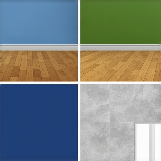
Don’t Paint Over a Problem and Expect it to Vanish
A common trap for DIYers is the urge to simply cover up a color disaster with a thicker coat. If your paint is shifting or failing, more pigment isn’t always the answer. For instance, if you are moving from an old oil-based trim to a modern water-based blue, simply slapping on a new layer will lead to catastrophic peeling. You have to know how to successfully paint over oil-based finishes by using a specialized bonding primer. Furthermore, the reason you should never paint over peeling paint is that moisture trapped beneath will continue to push the new layer off, regardless of the brand. True local painting secrets aren’t about the brushwork; they are about the chemical bond between the substrate and the pigment. Have you ever fallen into this trap where a ‘quick fix’ turned into a week-long project? Let me know in the comments.
Why Your Favorite Paint Brush is Probably Your Worst Enemy
I used to think a brush was just a brush until I spent forty dollars on a single handcrafted Purdy and realized I had been sabotaging myself for years. If you want to unlock the power of professional painting, you have to stop buying the three-pack of ‘economy’ brushes at the checkout counter. Those cheap polyester bristles don’t hold enough paint, forcing you to over-work the surface, which leads to the very brush marks and texture issues we spent all day trying to avoid. I personally swear by a 2.5-inch angled sash brush for everything. It gives you the only way to get a sharp line without spending four hours with a roll of tape. This is a non-negotiable part of any local painting strategy; a high-quality tool does half the work for you by laying the pigment down flat.
One Simple Trick to Stop Making a Mess of the Rim
Before you dip that expensive brush, stretch a thick elastic over the open can. I call this the rubber band trick for keeping paint cans mess-free. It sounds too simple to be a ‘secret,’ but it prevents the rim from filling with gunk, which eventually prevents the lid from sealing properly. If that lid doesn’t seal, your expensive ‘Coastal Breezeway’ will be a brick of rubber by next spring. 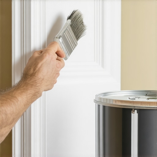 To truly master the art of house painting, you need to think about the longevity of your materials, not just the speed of the application. According to the Master Painters Institute (MPI) Technical Manual, the integrity of the paint film starts with how the liquid is handled before it ever touches the wall. If you are dealing with old woodwork first, don’t forget the hammer and cloth trick for fixing dented trim before you even think about opening a can.
How do I maintain my home’s paint job over time?
Long-term success isn’t just about the first coat; it is about knowing how to maintain your newly painted exterior or interior for the next decade. Every six months, I do a ‘walk-around’ with a damp microfiber cloth. You’d be surprised how much dust and cooking grease can chemically bond to your walls, dulling that perfect finish. If you aren’t sure if your paint is cured enough to scrub, use the knife test for checking if your paint is truly dry. Looking forward, I predict we are going to see a massive shift toward ‘smart’ mineral-based coatings that actively pull pollutants out of the air. We are already seeing innovative house painting ideas involving photo-catalytic pigments that keep themselves clean using UV light. For now, focus on the basics: buy the expensive brush, use the rubber band, and stop trusting the mid-day sun. My challenge for you this weekend? Go to your local hardware store, buy one high-end 2.5-inch angled sash brush, and try to cut in a corner freehand—you will never go back to the cheap stuff again.
Hard Truths from a Former Victim of the Purple Wall
Looking back at my first ‘bruised plum’ disaster, I realized that the price of the paint is secondary to the environment it lives in. I used to think I could out-stubborn the physics of light, but light always wins. One major lightbulb moment was realizing that north-facing rooms actually need those green-based blues to avoid looking like a cold hospital ward. Another lesson? Never trust a contractor who doesn’t talk to you about your lightbulbs; if they aren’t asking about your lighting, they aren’t giving you local painting secrets that actually matter. Finally, I learned that a third coat isn’t a sign of failure—sometimes your new home needs a third coat just to fully block out the previous owner’s choices and ensure the undertone stays true.
My Go-To Gear for Nailing the Right Shade
If you are serious about your project, ditch the sample pots painted directly on the wall. I always recommend using large foam core boards from a craft store for the ‘Moveable Swatch’ method. For the actual application, I trust nothing but a high-end 2.5-inch angled sash brush to get the only way to get a sharp line without hours of taping. I also keep the Master Painters Institute (MPI) technical manuals bookmarked for when things get really weird with chemical reactions or pigment shifts. If you are feeling overwhelmed, browsing innovative house painting ideas can give you a fresh perspective on what is possible for your specific architecture in 2025.
Take the Leap and Claim Your Color
Painting is not just about maintenance; it is about how you feel when you walk through the door after a long day. Do not let the fear of a ‘periwinkle pivot’ stop you from trying a bold new look. With a bit of lighting science and the right tools, you can transform your home with expert house painting tips and finally get the room you envisioned. If you hit a wall, literally or figuratively, do not hesitate to contact us for professional guidance. Have you ever picked a ‘perfect’ gray or blue only to have it look completely different by dinner time? Drop your most shocking color-shift stories in the comments below!