

It hit me one rainy Saturday afternoon while I was staring at a faded swatch of my grandmother’s old living room wall. I wanted to restore that charming vintage look, but the problem was—how do I match those historic colors without sending a sample off to a costly, professional lab? I felt like I was stuck in a paint conundrum, frustrated and unsure if my DIY efforts would turn out a disaster or something worth proud of. If you’ve ever faced the challenge of recreating historic hues on your own, you know exactly what I mean—the anxiety of mixing the right shade, the fear of wasted time, and the cost that comes with trial and error. But here’s the good news: after some personal experiments and a few never-fail tricks, I figured out how to nail those vintage tones using simple, accessible methods. Today, I promise to share exactly how I learned to do this, saving me hundreds in professional lab fees and countless hours of guesswork.
Why You Don’t Need a Lab to Match Historic Paints
Now, I know what some of you might be thinking—”Isn’t that only possible with expensive equipment and expert analysis?” Well, surprisingly, no. A study by the Paint and Coatings Industry reveals that many historic colors can be accurately recreated using traditional color-matching techniques combined with a little patience and some clever tricks. The key is understanding the nuances of color, light, and aging—things you can observe firsthand without a lab. Plus, with the right tools and methods, you’ll be amazed at how close you can get to those original hues, no matter your skill level. I remember making a costly mistake early on—I relied solely on online digital color matching apps, expecting perfection. Instead, I ended up with a shade that looked like a washed-out version of the real thing. That taught me an important lesson: human eyes and simple measurements can sometimes outperform complicated tech when it comes to historic color recreation.
Are DIY Color-Matching Methods as Reliable as Professionals?
It’s a fair concern. I used to think that only professionals with specialized equipment could achieve authentic results. But as I gathered more experience, I realized that many historic tones are within reach by paying close attention to details like hue, saturation, and aging characteristics—things that can be observed naturally. Learning to identify these factors turned out to be my secret weapon. And if you’re curious about bringing expert-level insights into your project, I recommend exploring strategies like sample analysis and subtle tone adjustments—techniques discussed in depth on sites like local painting strategies. Trust me, you don’t need a PhD or a fancy lab—just a bit of patience and a splash of curiosity.
If you’re ready to stop second-guessing your color choices and want practical, achievable tips—keep reading. I’ll walk you through my tried-and-true methods, so you can confidently match those fascinating historic shades all on your own.
,
Choose the Right Base for Your Color Match
Start with a small, clean sample piece of the original paint — a chipped edge or corner works well. I remember once plucking a tiny sliver from a weathered window frame that had endured decades outside. I used a kitchen knife to gently scrape the sample onto a white paper towel, aiming for minimal damage. This sample will serve as your reference point, so handle it carefully to avoid contamination from dirt or grime, which can skew your results.
Observe and Record Key Color Traits
Next, examine your sample under natural light. Identify its dominant hue — is it a warm beige or a cool gray? Note any signs of aging, like yellowing or fading. I once found a faded blue that had darkened to a slate tone, so I made a mental note of that change. Sketch a quick color wheel approximation or note the shade’s position on standard color charts. This helps refine your target hue and prevents over-guessing during mixing.
Use a Color Mixing Chart as Your Guide
Refer to a reliable color mixing chart, which displays how different pigments blend. Think of it as a recipe book for colors. When I aimed for a vintage olive green, I combined yellow ochre with small amounts of black and a touch of white, based on my chart. Adjust quantities incrementally—tiny drops matter. Keep notes of your ratios for future reference. This method transforms guesswork into a calculated process that consistently yields better results.
Create a Test Batch and Compare
Mix a small test batch using your chosen ratios. Apply a thin coat onto a neutral card or scrap plywood — avoid painting directly over the original surface, which may be textured or glossy. Place the test patch next to your original sample in daylight to compare. In my experience, I once mixed a shade that was too dark; adding a bit more white lightened it precisely. This step allows fine-tuning before risking larger quantities, saving both materials and frustration.
Adjust and Refine with Subtle Changes
Small adjustments are key. If your test appears too warm, introduce a touch of blue or green to neutralize it. Too dull? Brighten it with a tiny amount of yellow or red. I once struggled with matching a faded antique cream, but by gradually adding tiny amounts of titanium white and a smidge of yellow, I reached a close approximation. Repeat testing until the color matches seamlessly in various lighting conditions.
Document Your Final Recipe
Once satisfied, write down your precise pigment ratios and mixing method. This documentation speeds future projects and ensures consistency. For example, my go-to historic shade now involves 4 parts yellow ochre, 1 part black, and 2 parts white. Having this ready allows seamless replication, especially when touching up or repainting larger areas. Remember, patience and attention to detail significantly improve your craftsmanship.
By following these straightforward steps, recreating historic colors becomes an accessible and rewarding process. Every mix deepens your understanding of color nuances, making future projects even more authentic. And if you’re ever unsure or want to explore advanced techniques, many professionals recommend strategies like local painting tips to elevate your work without breaking the bank.
When it comes to house painting, many assume that choosing the right color and applying a fresh coat are the main hurdles. But as an expert in the field, I can tell you there’s a common misconception that often leads homeowners and even some pros astray. The prevailing belief is that as long as you’ve selected good-quality paint and used the proper tools, a flawless finish is guaranteed. However, this overlooks the subtle yet crucial factors that can make or break your painting project.
One widespread myth is that surface preparation is a tedious step that can be minimized or rushed. In reality, neglecting proper prep—like thorough cleaning, sanding, and priming—can result in premature peeling, uneven textures, and color inconsistencies. This oversight is an easy trap to fall into, especially when homeowners are eager to skip to the painting stage. Remember, proper surface prep is the foundation of durable, professional-looking results. Skimping here might save time initially but cost you more down the line.
Why is color consistency in multiple rooms more complex than it seems?
Many assume that once they’ve matched a color, subsequent applications will look identical. Yet, factors like sheen levels, application techniques, and even wall texture impact final appearance. For example, a matte finish absorbs light differently than semi-gloss, altering how the color is perceived. Advanced painters pay attention to these nuances—they often use the same batch of paint and identical application tools to ensure uniformity. Avoiding the temptation to use leftover paint from previous orders without verifying batch consistency can prevent frustrating mismatches in the future. For a deeper dive into perfecting color continuity, check out local painting solutions that emphasize consistency across all surfaces.
Another *hidden* nuance involves understanding how lighting conditions alter perception. Natural light reveals true colors, while artificial lighting can cast warm or cool tones. Recognizing this, expert painters often test samples under multiple lighting scenarios before finalizing their choices. This is a step many overlook, leading to displeasure with the final look once the project is complete.
Many homeowners also underestimate the importance of choosing the right finish based on the room’s function. A mistake I often see is opting for flat paint in high-traffic areas like hallways or kitchens. This choice can result in visible scuffs and frequent cleaning, damaging the finish over time. Instead, using scuff-resistant, durable finishes can vastly improve both appearance and longevity—details covered more thoroughly in expert painting tips.
Recognizing these hidden nuances—like surface prep, lighting effects, and finish selections—is what elevates a standard paint job into a true professional result. Don’t fall into the trap of thinking it’s just about color and applying paint. Instead, approach each project with attention to these advanced details, ensuring your space looks stunning and lasts longer.
Have you ever fallen into this trap? Let me know in the comments.
Keep It Running: The Tools That Make the Difference
Investing in the right equipment is crucial for achieving durable, high-quality results in house painting. From preparation to finishing touches, specialized tools save time, improve precision, and extend the longevity of your work. One drill I personally swear by is the variable-speed orbital sander. It provides smooth surfaces by evenly removing old paint and preparing the substrate without gouging. This step is vital because any unevenness can lead to premature peeling or uneven gloss. Using a high-quality paint sprayer with adjustable settings further allows for even coats and reduces drips, especially when working on large surfaces or intricate trim.
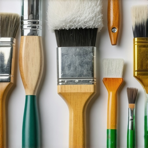
For meticulous edge work, I rely on a angled detail brush with synthetic bristles. It enables precise cuts around moldings and windows, maintaining crisp lines that stand the test of time. Additionally, a long-handled roller frame prevents fatigue during extensive wall coverage, making the process more comfortable and consistent. To ensure your paint adheres properly and lasts, don’t overlook the importance of proper surface prep tools. A quality wire brush and a fanning sander help achieve a smooth, clean surface that bonds well, reducing the risk of flaking or bubbling over time.
How do I maintain my tools for long-term use?
Regular cleaning is the key. Rinse brushes immediately after use with warm water or solvent-based cleaner, depending on your paint type. Store brushes flat or hanging to maintain their shape, and replace worn-out rollers or brushes promptly to preserve finish quality. Sharpen or replace blades on sanding tools as needed, since dull blades can mar surfaces or introduce irregularities that compromise durability. Using proper storage racks not only prolongs tool life but also prevents contamination that could affect your paint’s adhesion or finish. As trends evolve, innovations like self-cleaning brushes and high-efficiency spray tips are gaining popularity, promising even better results and ease of maintenance in the future. For now, investing in quality tools and maintaining them diligently will pay dividends in long-term, beautiful results. I highly recommend trying a professional-grade sprayer with adjustable pressure settings; it revolutionized my workflow and made my finishes much more consistent—plus, it extends the life of your paint layers by reducing overspray and waste. Discover more about these innovations by visiting local painting strategies. Proper tool care and selection are vital for homeowners and pros alike seeking to ensure their work endures for years. Don’t hesitate to give your tools a thorough cleaning and calibration after each project—your future projects will thank you!
Three Lessons That Changed How I Approach Custom Colors
- Perfection Comes from Patience: Rushing the color-matching process often leads to disappointment. Taking the time to observe subtle aging signs and adjusting gradually saves both time and paint, leading to authentic results that stand the test of time.
- Ditch the Digital Dilemma: Relying solely on digital color matching tools can mislead you. Calibrating your eyes and learning to interpret real-world samples still reign supreme—trust your senses for true color fidelity.
- Understanding Light Levels is Key: Colors can look entirely different under various lighting conditions. Testing samples in natural, fluorescent, and incandescent light ensures your historic hue remains consistent throughout the day.
Tools and Resources I Swear By for Color Accuracy
- Spectrophotometers: While professional-grade tools can be costly, small handheld spectrophotometers provide precise readings and are invaluable for recreating historic shades accurately. I’ve personally found them to be game-changers in fine-tuning my mixes—discover more about these at Transforming Spaces.
- Color Mixing Charts and Recipes: Having a trusted guide with proven pigment ratios streamlines the process. Books like Historic Paint Colors can be a treasure trove, offering recipes rooted in historical accuracy that I consult regularly.
- Sample Testing Kits: Small test-painting kits allow you to experiment without wastage, adjusting your ratio until perfect. The allowance for quick iterations removes the guesswork, giving you confidence in your final mix.
Embrace the Journey and Make Your Space True to Its Roots
“Every brushstroke and color choice connects your home’s past to its future. When you master the art of recreating historic paints on your own, you don’t just update your walls—you preserve a legacy. This process is a rewarding blend of patience, observation, and experimentation. So, whether you’re restoring a vintage interior or paying homage to a bygone era, remember that confidence grows with each trial. Don’t hesitate to reach out and share your progress—your home’s story deserves to be told with authenticity and care. Ready to bring those historic hues to life? Let’s make your space truly timeless.”
What has been your biggest challenge in matching a historic paint color? Share your experiences below!