

I stood there with a half-empty tray of “Morning Mist” gray, feeling like I’d just committed a crime against my own living room. My honey oak trim, which had felt cozy just ten minutes ago, was now vibrating with a neon orange intensity that I could practically see from space. It was my first big DIY project, and I had failed the most basic rule of color theory: undertones matter. I thought I could modernize the space by forcing a cool, trendy palette onto a warm-toned foundation. I was wrong. I ended up with a room that looked like a battleground between two different eras. The orange wood looked angrier, and the walls looked like a cold, sterile hospital wing. [IMAGE_PLACEHOLDER]
Stop Fighting Your Woodwork and Start Coordinating
Most homeowners I talk to feel trapped by their 1990s honey oak. You want that crisp, Pinterest-worthy aesthetic, but every sample you slap on the wall feels “off.” I’ve been there. I once spent an entire weekend trying to refresh my space only to realize I’d made the orange tones stand out even more. The reality is that honey oak isn’t a neutral; it’s a dominant color that demands respect. Today, we are going to fix that. I’m going to show you how to pick colors that harmonize with that warmth instead of clashing with it. We’ll look at why certain grays turn blue or purple next to oak and which whites actually look clean rather than dingy. According to the principles of color theory, complementary colors (like blue and orange) will make each other pop, which is exactly what we want to avoid if you’re trying to tone down the wood. If you use a blue-toned gray, you are literally highlighting the orange.
Does Anyone Actually Like This Orange Wood Anymore?
You might be skeptical. Maybe you’re thinking that no amount of paint can save a house filled with golden oak. I used to think the only solution was a sledgehammer or a total renovation. But after years of experimenting (and some embarrassing failures), I’ve learned that the right wall color can actually make oak look like a deliberate, high-end design choice. The mistake I made early on was reaching for stark, clinical whites. I thought they would provide contrast. Instead, they made the room feel disjointed. Nowadays, I’m seeing a massive shift where warm white is replacing stark white in most professional designs because it bridges the gap between old-school wood and modern sensibility. It softens the blow of the orange without looking like you’re living inside a stick of butter. Have you ever finished a paint job only to realize your walls and trim were practically screaming at each other? Tell me I’m not the only one who has had to repaint a “finished” room after just twenty-four hours. Before we get into the specific swatches, you need to understand the “why” behind the clash. If you don’t grasp how light affects these tones, you’ll just end up back at the hardware store buying more samples. You have to consider how your flooring interacts with the wall, especially if your floor is also oak. I learned that lesson the hard way after painting a guest room three different times in one month.
Put Down the Paintbrush and Check Your Undertones First
To stop the war between your walls and your woodwork, you have to treat your honey oak like a roommate, not an enemy. This wood is naturally loaded with yellow and orange pigments. When you pick a paint color with a cool, blue-based undertone, you are following the rules of high contrast, which only makes the orange scream louder. Instead, you need to find ‘bridge’ colors. These are shades like warm grays, creamy whites, or muted greens that share a tiny bit of that golden DNA. Before you even open a can, you need to check the science of why gray walls change color in different settings. A color that looks like a soft pebble in the store might look like a frozen glacier once it hits the wall next to your trim. Think of it like dressing for your skin tone; if you have warm undertones, a stark, icy blue makes you look washed out. The same applies to your 1990s trim. 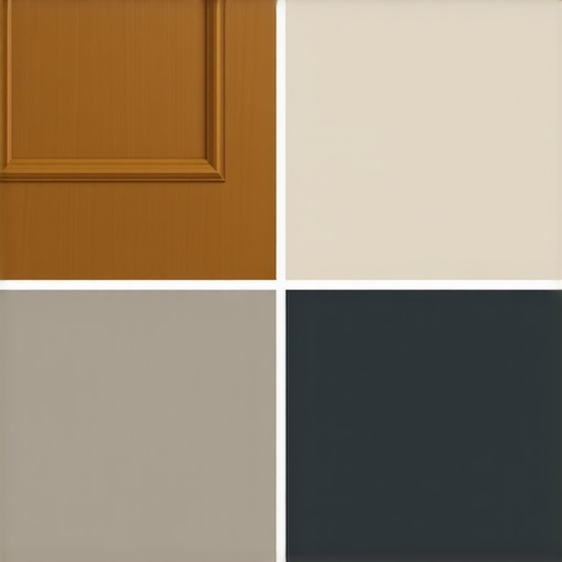
Stop Squinting at Those Tiny Paper Swatches
One of the biggest mistakes I ever made was choosing a color based on a two-inch piece of cardboard. I was working on a hallway with massive oak baseboards and I picked a shade called ‘Desert Sand.’ I thought it was neutral. After spending six hours painting, the entire hallway looked like the inside of a bowl of split pea soup because the green undertones in the paint reacted wildly with the orange wood. I didn’t estimate how much paint I actually needed for the inevitable second (and third) coat to cover up that disaster. Now, I tell everyone to use large peel-and-stick samples or paint a two-foot square of poster board. Move that board around the room at different times of the day. If it looks ‘dirty’ or ‘muddy’ next to the wood at 4 PM, it is the wrong color.
Switch Your Lightbulbs Before You Swatch
Lighting is the silent killer of great house painting. If you are still using old-school incandescent bulbs, they are pumping yellow light into an already yellow room. This doubles down on the honey oak’s warmth and makes it impossible to see the true color of your paint. Before you finalize your choice, switch to ‘soft white’ or ‘neutral’ LEDs (around 3000K to 3500K). This provides a cleaner light that doesn’t artificially warm up the walls. I’ve seen local painting projects go south simply because the office walls look different depending on the bulb. Once your lighting is consistent, you’ll see the paint for what it really is, not what the bulb is forcing it to be.
Why You Might Need a Third Coat of White
If you decide to go with the ‘modern farmhouse’ look and choose a warm white, be prepared for the coverage struggle. Honey oak is often paired with dark, dated wall colors. When you switch to a lighter palette, your home might need a third coat of white paint to truly hide the old pigments and the wood’s reflection. When I redid my own kitchen, I thought two coats would be enough. By noon the next day, the old beige was still ghosting through, making the new white look cheap and streaky. To truly master the art of house painting, you have to be patient with the transition. A third coat isn’t a failure; it’s the secret to that crisp, professional finish that actually makes the oak look intentional and high-end.
I know what you’re thinking: if I just buy the most expensive gallon of ‘greige’ at the store, my house will finally look like a high-end magazine. But here is where I’m going to challenge the common wisdom. Everyone says ‘neutral’ is the safest bet, but in my experience, neutral is often a trap. A true pro-level house painting project succeeds not because of the color on the swatch, but because of the Light Reflectance Value (LRV) and the chemical bond between layers. If you pick a gray with a low LRV in a room with heavy oak, the wood will literally suck the life out of the walls, leaving you with a space that feels heavy and ‘muddy’ rather than modern. You have to color your world with expert advice that accounts for how those honey-colored reflections hit the vertical surfaces of your walls.
Why Does Your High-End Trim Paint Keep Chipping?
One of the most frustrating ‘oops’ moments I see involves homeowners who buy top-tier paint but skip the chemical assessment. Most of that 1990s honey oak was finished with a high-gloss oil-based sealer. If you try to slap a modern water-based latex on top of it—even with ‘built-in primer’—you are setting yourself up for failure. According to the Paint Quality Institute, the lack of mechanical adhesion on glossy surfaces is the leading cause of coating failure. You must learn how to successfully paint over oil-based finishes by using a bonding primer specifically designed for high-slick surfaces. Without it, your beautiful new color will literally peel off in sheets the first time a vacuum cleaner bumps the baseboard.
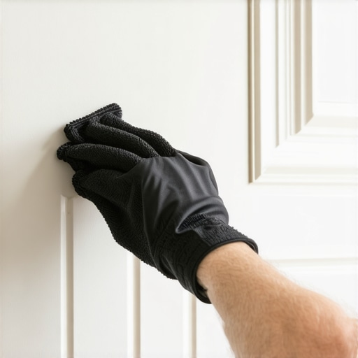
Let’s dig deeper into the walls themselves. Before you start, perform the ‘damp rag test.’ Take a wet, dark-colored cloth and wipe a large section of your wall. If you see a chalky residue on the rag, your wall is ‘oxidized’ or simply too dusty for the paint to grab. I’ve seen local painting crews have to redo entire living rooms because they ignored the fact that a chalky wall prevents a clean bond. This is the hidden nuance that separates a DIY job from a professional transformation. If you don’t prep the substrate, the most expensive paint in the world won’t save you.
Can You Actually Paint Your Radiators to Match the Walls?
Nothing ruins the flow of a newly painted room like a rusted, off-white radiator clashing with your fresh warm-white walls. Most people think radiators are off-limits, but that is a myth. You can absolutely integrate them into your design, provided you use the right thermal-resistant coatings. I’ve seen people paint their radiators without getting a headache by choosing low-VOC, high-heat formulas that won’t off-gas when the heat kicks in. It’s these small, often-ignored elements—like radiators, metal bulkheads, or floor vents—that either anchor your design or make it feel unfinished. To get that seamless look, you also need to master the only way to get a sharp line between your walls and that stubborn oak trim.
Have you ever finished a room only to realize your ‘gray’ walls turned into a 1980s lilac as soon as the sun went down? It happens more often than you’d think, especially because blue-toned walls look purple when they interact with the amber glow of wood floors and warm lightbulbs. Have you ever fallen into this trap where a color looked perfect in the store but totally different in your home? Let me know in the comments below! If you’re feeling overwhelmed by the technical side of things, it might be time to unlock the power of professional painting to ensure your vision matches the reality of your architecture.
How Can I Keep My New Paint Looking Fresh for Years?
Once you’ve successfully bridged the gap between your wall color and that honey oak trim, the battle isn’t over; it’s just shifted to maintenance. I used to think that once the paint dried, my job was done for a decade. I was wrong. Dust and oils from your hands can actually degrade the finish of your paint over time, especially near door frames and light switches. To maintain your newly painted interior, you should actually wait at least 30 days for the paint to fully cure before you even think about scrubbing a smudge. If you jump the gun, you’ll burnish the paint, creating a shiny spot that you can never get rid of without repainting the entire section.
My Secret Weapon for Perfect Trim
I get asked all the time what brush I use to get those laser-straight lines against oak baseboards. I don’t use the cheap five-pack from the discount bin. I exclusively use a 2.5-inch angled sash brush—specifically the Purdy XL series or a Wooster Silver Tip. The reason is simple: the bristles have the right flex to hold a heavy load of paint while still tapering to a sharp edge. If you’ve been struggling with sloppy edges, local painting solutions often come down to the quality of the nylon-polyester blend in your hand. Also, please, for the love of your equipment, stop cleaning your brushes with harsh chemicals; avoid using cheap white spirit because it strips the natural oils from the bristles, making them splayed and useless for your next project.
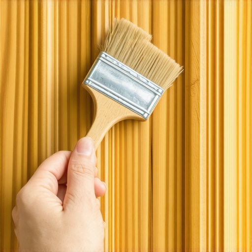
Looking ahead, I suspect we are moving toward a world where AI-driven light sensors will be built into our smartphones to help us perfectly match undertones in real-time, eliminating the guesswork of home design. Until then, we rely on the technical standards set by the Painting and Decorating Contractors of America (PDCA). Their P1 standard for a properly painted surface means the finish should be uniform when viewed from three feet away under normal lighting. If you see a drip that missed the cut, don’t panic. You can remove dried paint drips using a sharp razor blade and a light touch, saving you from a full sand-down. I challenge you to try the angled brush technique on your next small touch-up; you’ll be amazed at how much control you gain over that tricky oak transition. If the technical side still feels like a mountain, you can always reach out to a pro to get that factory-finish look without the headache.
The Hard Truth About Why Your Swatches Keep Lying
After years of trial and error with house painting around dated wood, I’ve realized that the biggest hurdle isn’t the paint itself—it’s the ego. We often try to force a trend onto a house that is fundamentally warm. My biggest ‘lightbulb moment’ came when I stopped trying to make my living room look like a cold industrial loft and instead leaned into the coziness. I learned that ‘neutral’ is a spectrum, and finding local painting secrets means understanding that the best color is the one that acknowledges your architecture rather than fighting it.
#IMAGE_PLACEHOLDER_E#
- The Pink Trap: Be wary of ‘cool’ whites; they often have a hidden pink or blue undertone that makes honey oak look radioactive.
- Texture is King: If your walls have a heavy orange peel texture, why high-gloss paint is a nightmare becomes immediately clear; it highlights every bump and makes the wood look even more dated.
- The Shadow Effect: Always look at your paint in the corners where the wall meets the floor. That is where the wood’s reflection is strongest and where your color choice will be truly tested.
The Non-Negotiables in My Painting Kit
To get a professional-grade look, you need more than just a bucket of color. I personally swear by the Purdy XL Dale for cutting in; it has the perfect stiffness for those of us who don’t have a perfectly steady hand yet. I also highly recommend the Sherwin-Williams ColorSnap Visualizer app. It isn’t perfect, but it helps you visualize how those big blocks of oak will interact with new shades. For a deeper dive into modern aesthetics, I always keep a copy of the expert house painting tips for 2025 nearby to stay ahead of color shifts.
Reclaim Your Space Without the Renovation Stress
You don’t need a sledgehammer to make your home feel fresh again. By choosing the right ‘bridge’ colors and respecting the undertones of your wood, you can transform a dated room into a sophisticated sanctuary. Whether you tackle it yourself or decide to unlock the power of professional painting, the most important step is simply to start. Your home should reflect who you are now, not who built it thirty years ago. Have you ever picked a paint color that looked perfect in the store but turned a completely different shade on your walls? Let me know in the comments below!